Configuring Multiple Colour Palettes In Tailwind CSS
05 January 2021
Photo: Unsplash - Jessica Ruscello
I recently wrote about the Tailwind CSS framework and how productive I have found it on my recent projects. One of those projects decided to do a partial redesign to test a new landing page layout. The changes included a brand new colour palette and given how Tailwind defines colours in the config I wondered how I could support both colour palettes.
It turns out tha Tailwind made this really easy.
Basic Tailwind Color Configuration
Tailwind comes with a full colour palette defined which you can use by adding the following line to your tailwind.config.js file:
const colors = require("tailwindcss/colors");
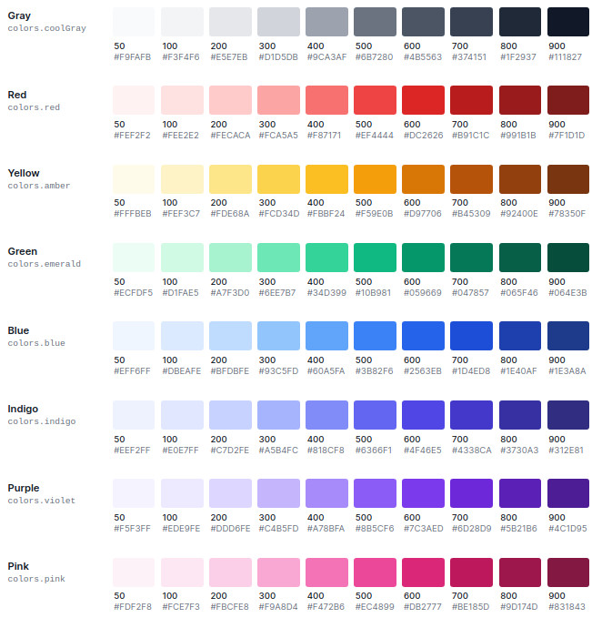
This provides the following colour shades for you to use in your project:

You can access any of the shades above in your utility classes by specifying the colour and variant, as follows:
<div class="border border-red-400 bg-blue-400 text-yellow-400">A clash of colour</div>
Extending The Tailwind Colour Palette
You can define your own colour palette by adding your configuration to the theme section within the tailwind.css.js file:
module.exports = {
  theme: {
    colors: {
      // Define your colour settings here
    },
  },
};
By defining your own palette as part of your theme configuration, you can define your own shades to override the default colours that Tailwind provides:
module.exports = {
  theme: {
    colors: {
      blue: {
        300: "#ced8df",
        400: "#b5c4ce",
        500: "#849dae",
        600: "#637683",
      },
    },
  },
};
Here I am overriding the shades of blue for shades 300, 400, 500 and 600. I can continue to use the remaining predefined blue shades that Tailwind offers without having to override them.
You can take this further. If you want to limit yourself to a subset of shades per colour, you can provide custom identifiers for the shades you want instead of sticking to the number identifiers. For example:
module.exports = {
  theme: {
    colors: {
      blue: {
        light: "#ced8df",
        default: "#849dae",
        dark: "#637683",
      },
      yellow: {
        light: "#ffd774",
        default: "#ffca46",
        dark: "#ffbd18",
      },
    },
  },
};
You would then access them in your utility classes as follows:
<div class="border border-blue-default bg-blue-dark text-yellow-dark">A clash of colour</div>
All this flexibility provided a really easy way to define a second colour palette, as I needed for my project. I had already defined a colour palette as part of the original implementation using the standard 50 - 900 shade mechanism. All I had to do was define the new colour palette and use a custom naming convention to segregate the shades.
module.exports = {
  theme: {
    colors: {
      gray: {
        100: "#cfd3d6",
        homePage100: "#9fa6ad",
        300: "#707a83",
        homePage300: "#404d5a",
        500: "#102131",
        homePage500: "#0c1925",
      },
    },
  },
};
The Tailwind Purge Configuration Option
One of the really useful things that Tailwind does is to optimise the generated CSS file to only include the utility classes you have used in your site. This means that if you do not apply blue-500 to any element then no blue-500 css classes will be produced. This functionality is enabled by the purge configuration option as shown below:
// tailwind.config.js
module.exports = {
  purge: {
    enabled: true,
    content: ["./src/**/*.html", "./src/**/*.html", "./src/**/*.jsx", "./src/**/*.js"],
  },
};
The content field is used to specify the file types to parse when determining the classes to generate.
I mention this mainly for those of us that are using frameworks such as React or Vue. If you take advantage of the “purge” functionality (and why wouldn’t you?) you can not use string interpolation to build dynamic style attributes. So the following wouldn’t work:
const colour = "blue-500";
<div className={`bg-${colour} text-white`}>This will have no background colour</div>;
Where as this will:
const colour = "blue";
<div className={`${colour === "blue" ? `bg-blue-500` : `bg-none`} text-white`}>This will have a blue background colour</div>;
This is down to the way Tailwind parses the utility classes to remove using PurgeCSS. I will write more on the impact of this soon.
Wrapping Up
Tailwind provides a very flexible configuration mechanism to allow you to define your theme and colour palette as you need.
I would advise against adding a secondary palette unless you have a real need (as in my case) as you then weaken two of Tailwinds great strengths, simplicity and intention, I have already migrated the remainder of the project to the new colour palette and removed the secondary palette. If you do add multiple colour palettes I would recommend you use specific identifiers in your config to associate the shades to particular pages or areas of your site. Make it obvious to other developers why the additional palettes exist and it’s intention.
If you have any questions about Tailwind or configuring the colour settings then let me know via twitter or email.
 Welcome to my site and blog. You can find out about me and read my thoughts on code and technology, start-ups and building things.