Frustrating UI's
12 December 2017
Photo: Tim Gouw - Unsplash
UI’s can be the difference between a killer application and something that someone has to use.
Well crafted UI’s focus the user’s attention on the task they are undertaking. It presents the data in a clear and concise manner. It will also allow the user to complete the task in the simplest manner with the least effort.
Sometimes that is not the case
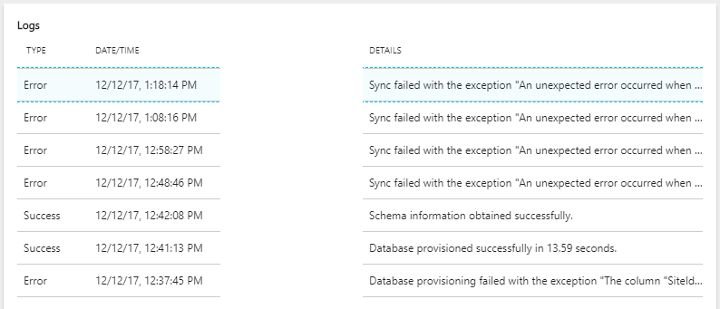
Take the screen below

(Some data is obscured for obvious reasons)
Azure’s UI is like Marmite, some people love it and some do not. On the whole I have grown to like many parts of the UI. I also understand they are improving the service and UI all the time incrementally.
But, look at the picture again. You will see that there is no way to expand the table columns that actually contains the log message. I found this out when having issues setting up a data sync. The process kept failing and leaving nice long log messages for me. The only way I could get to read the whole message was to hover over the log column. Then the message displayed in a tooltip. Very frustrating.
I am someone that will Google furiously before raising a support ticket. Not being able to copy the data hampered this. In the end, the only way I could find to copy the data was to use Chromes dev tools. A quick inspection later and I copied the data from the elements title attribute to use in my searches.
Now I am picking on Azure here and that’s not entirely fair. I would guess though that there are many frustrating application UI’s out there.
 Welcome to my site and blog. You can find out about me and read my thoughts on code and technology, start-ups and building things.